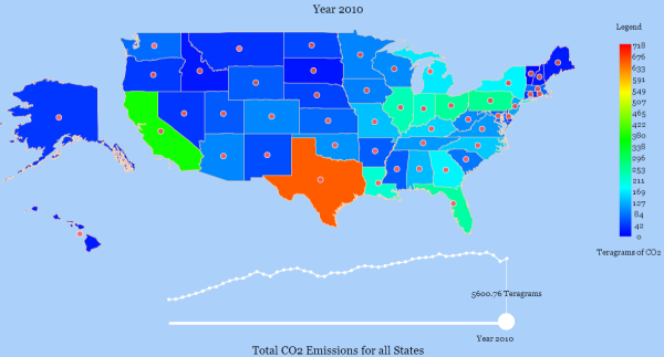
Emissions by state. Click to see the interactive version.
This post is related to NPR’s Planet Money’s podcast “Episode 472: The One-Page Plan To Fix Global Warming“. In the podcast, Alex Blumberg and David Kestenbaum describe their approach to reduce carbon dioxide (CO2) emissions, the chief cause of global warming. Their one step approach is to tax emissions. It’s an interesting podcast, well worth the 20 minutes.
I titled this post “My interactive visualization of CO2 emission data by state”, but an equally suitable name would have been, “Which state would pay the most if CO2 emissions were taxed?” The answer? You don’t really have to read the rest of my blather, you can click through and see the clear “winner” for yourself: Heat Map of CO2 emissions by state, 1960 to 2010.
The infographic is a heat map that shows the Lone Star State Texas is truly alone in CO2 emissions. I’ve added a slider so you can see the historical perspective. The data from this graphic was collected from the government-supported Carbon Dioxide Information Analysis Center (CDIAC).
[Updated 8.27.2013 around 10am]
According to the CDIAC website’s description, the data seems to be entirely composed of fossil-fuel consumption: “The data from which these carbon-emissions estimates were derived are values of fuel consumed: in billions of cubic feet, for natural gas; in millions of barrels, for petroleum products; and in thousands of short tons, for coal.”
One wonders why Texas’ fuel consumption is so high. I sent an email to the CDIAC to find out and received a reply from TJ Blasing at Oak Ridge National Laboratory (CDIAC is a division of Oak Ridge National Laboratory). The reason Texas is so high compared to the rest of the nation is due to the fact that energy extraction/production generates large amounts of CO2 as a by-product. Those CO2 emissions are charged directly to Texas since that was where the CO2 “dump” occurred.
So I suppose when I asked “Which state would pay the most if CO2 emissions were taxed?” the anwer would really depend on what sort of tax it was. If it’s a consumer tax, the taxes would be much more evenly spread across all states than the visualization shows because Texas consumers use fuels at a similar rate compared to other states.
If the CO2 tax is implemented as a business tax, then my chart would be much more skewed than it shows!
And if it’s some combination of a consumer and business tax, then it would basically be correct.
To tie things up, turning to a global perspective, the US imports a significant amount of fuel from the rest of the world. The production of these fuels makes those other countries’ CO2 emissions very high, although it is the US that is benefiting from consuming these fuels. So this scenario plays out internationally as well as locally.
I swiped the following slide from a presentation at a recent meeting on global CO2 emissions (slide 28) that was forwarded to me by TJ:

Where fossil fuels are extracted and who uses them. Taken from a presentation from the Global Carbon Project.
Here is the partial text of TJ Blasing’s reply:
Lyndie:
We are dealing with emissions where they are produced because we are concerned with the global carbon cycle: a. where does it come from; b. where does it go, and c. what happens on the way from a to b. This is the chemistry and physics side of things, if we put a certain amount of oxidized carbon in the atmosphere, how long will it stay in the atmosphere and how much climate change will that cause?
… The USA “outsources” around 100 teragrams of carbon per year to China, and to many other countries as well. The USA would be charged with much more carbon emissions If we calculated it by where products are actually consumed, rather than where they are produced.
In the USA, at least so far, regulators adjust for this; however in international negotiations, it is important.
Back to the USA; we regulate things like fuel economy of cars and efficiency of power plants rather than taxing states that produce things we all use, like coal and oil. So when you go posting things like our state-by-state emissions, I would … put in the appropriate caveats. The community of geophysicists already knows this stuff, as does EPA and regulators….
“Fossil-fuel carbon emissions by state” would be a correct title. So would “emissions of oxidized carbon from fossil-fuel combustion, by state.” For example, West Virginia burns a lot of coal to make electricity for other states. The carbon from that coal consumption is charged to West Virginia.
California imports about 25% of its electricity from other states. That carbon emitted to make that electricity is charged to the other states.
Texas makes a lot of motor gasoline; the carbon emitted from those refineries is charged to Texas; the carbon from combustion of that gasoline I use when I drive to work is charged to Tennessee.
…
TJ
References:
The data used here came from the Carbon Dioxide Information Analysis Center: http://cdiac.ornl.gov/CO2_Emission/timeseries/usa
EPA report on cement production from 1990: http://www.epa.gov/osw/nonhaz/industrial/special/ckd/rtc/chap-2.pdf
Vehicle registrations by state in 2003: https://www.fhwa.dot.gov/policy/ohim/hs03/htm/mv1.htm
NPR podcast: http://www.npr.org/blogs/money/2013/07/12/201502003/episode-472-the-one-page-plan-to-fix-global-warming

Adam Villani liked this on Facebook.
Prapakarn Johnston liked this on Facebook.
Lyndie,
I suspect what you’re seeing here is the effect of electricity generation being “charged where produced” rather than “charged where consumed.”
Texas supplies about 10% of the electric power in the country, including anywhere from 1/3 to 1/5 of the power from natural gas, which is the most significant source.
http://www.eia.gov/electricity/data/state/
The tip-off was this phrase, lifted from the source page for your data:
“Carbon emissions from coal combustion increased sharply in states that export electricity produced from local deposits of low-sulfur coal, so that states with low populations and large repositories of low-sulfur coal (e.g., North Dakota and Wyoming) are emitting about 10 times the coal carbon per capita (from coal, oil, and gas, combined) of more heavily populated states, such as California, that import much of their electricity. ”
Here is a fascinating analysis of power and fuel consumption by state:
http://www.e3network.org/papers/Why_do_state_emissions_differ_so_widely.pdf
Summary: It’s higher in Texas, though nowhere near as drastically as the colors show. There’s a nice comparison of the two states on page 6. CA per capita emissions due to consumption are 63% of TX per capita emissions. The difference is due more to the use of A/C on hot days than to vastly different transportation emissions.
Of course, Texas encouraging fuel-efficient commuter vehicles over inefficient suburbans can only help!
Beautiful graphic, by the way! I found myself marveling — how did you do that?
-Ender
Hi Lyndie! There’s a “charged where electricity is produced, not where it is consumed” effect: that is mostly what you’re seeing. Per capita, Texas is middle-of-the-road in terms of total emissions due to consumption. (I wrote a more detailed comment on your blog, with references.)
Thanks for the note ! I updated my blog post to include the exact source of the CO2 emissions.
To me, total CO2 emissions isn’t as interesting as CO2 emissions per capita. South Dakota is winning here, but that’s because nobody lives there. Which is the greater impact: taxing California $10B for their emissions, or taxing South Dakota $200M for theirs? (Answer: California; it works out to $265/person vs. $243/person.)
Yes, quite true. I did notice that if you divide by capita you get a different map. I believe Texas comes in 14th!!! Well behind Wyoming, the winner (115 metric tons/capita). Texas has the same story as China. Per person, they are much more fuel efficient than Europe/USA but because the population is so large, their emissions are very high. I’m guessing Wyoming may be due to farming/winter time heating, etc.
What I meant was, the electric generation industry in Texas consumes fuel (overwhelmingly natural gas, smaller amounts of coal and petroleum) to produce electricity. The electricity is consumed in other states.
David Cuthbert liked this on Facebook.
Andrew Rosenblum liked this on Facebook.
Josie Marsh liked this on Facebook.
Yes, actually this is a question mark… They certainly don’t make the distinction very clear on the website. I may send them an email to see what they say.
Gisela Catalina Maria liked this on Facebook.
I had an interesting exchange with someone from Oak Ridge National Labs who helped compile the dataset. He cleared up some misunderstandings. The title of my visualization is correct “CO2 emissions by state” although the reason Texas is so high is due to the high CO2 levels dumped into Texas’ air by extracting and producing fuels in that state. So I updated my blog post to discuss this a bit and include a few quotes from him.