I spent some time taking a look at what can be revealed by an image analysis of the letters of the alphabet. The results were insightful and a little bit surprising. I started the analysis small, looking at the individual letters of the alphabet. Then I moved on to applying the same techniques to the top 5,000 words and finally graduated to analyzing works of literature.
Probably the most enticing result was the ability (with an admittedly small sample) to categorize the subject matter of literature using image analysis.
Another noteworthy conclusion was that words with a higher number of “straight” letters (like i, j, l and t) tended to crop up more commonly in words than “round” letters (o, a, b and c). This is a bit surprising since if you rank the alphabet by letter frequency, the usage in the top 5,000 words had the same frequency as its ranking.
All this and more is better described below.
Image analysis on the alphabet
To make an image of the alphabet, I chose the simplest font I could find, Champagne and Limousines, which renders letters using a relatively pure combination of lines and circles. See the figure below for an example.

Champagne & Limousines font applied to an extract from the biography of Beethoven by George Fisher.
After a bit of experimenting, the easiest-to-interpret image processing method was the Fourier Transform. Specifically,
- Fourier Transform (FFT) an image of each letter along the horizontal axis.
- Count the number of resulting frequencies above a cut-off (to get the number of significant frequencies).
This method produced the following chart showing the resulting normalized metric per letter:
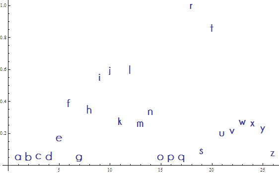
Normalized FT metric vs. lower case letters. Note that the straighter the letter, the higher the metric value.
I played around with other metrics including the Hankel Transform and 2D Fourier Transforms, but the results were not so easily interpreted and letters that looked like they should receive similar values (like “b” and “d”) ended up being very different.
First question: how does this metric compare to letter frequency in the English language? I obtained the letter frequencies from Wikipedia. The following chart shows the relationship between letter frequencies and our image metric:

Image analysis metric vs. letter frequency
The result is dirty, but I blindly fitted a line anyway (more on this line later). The x-axis shows the frequency of each letter (greater frequency implies the letter is more common) and the y-axis is the image metric. It vaguely looks like the more common the letter, the straighter the letter, with “e”, “a” and “o” being obvious outliers.
In the end, not much can be concluded from the above chart!
Image Analysis on Words, part 1
Moving on, I found a website that maintains a list of the top 5000 words in the English language for free (they also have lists of the top 100,000 words, but unfortunately, not for free). After a bit of data-cleaning (there were duplicates) I was left with 4,960 unique words.
The next step was to calculate the metric on the letters of these words and sum the result for each word. The results were then divided by word length for an equivalent comparison.
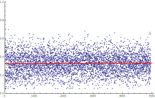
(metric)/(length of word)
It would appear that the vast majority of words have a similar metric score when normalized for word length. The fitted line had a slope on the order of 10^-6 — practically zero. A histogram illustrates the point more clearly:
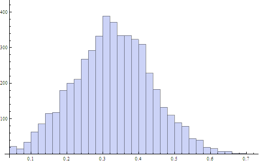
The histogram of the image analysis metric for the top 4,960 words.
The histogram shows the bulk of the words have an image metric score of 0.329 with a mean deviation of 0.087. Remarkably, the image metric score on words vs. word frequency agrees with the blindly fitted line for the image metric on letters vs. letter frequency.
Image analysis on words, Part 2
One of the limitations of just computing a metric on the individual letters and summing the result is it ignores the spatial relationship of letter placement within each word. So it is worth calculating the metric on the full images of each of the words and re-doing the result.
Sparing the details, the result looked quite different — a much lower average score of 0.0376 and mean deviation of 0.0226. The peak was also much sharper.
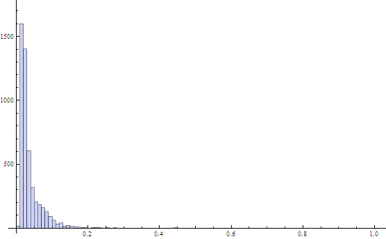
The metric calculated for the whole image of the top 4,960 words.
The explanation here is that rather than looking at the geometric properties of individual letters, we are looking at the words as a whole. The greater the number of letters, the less the overall uniqueness and the more each word tends to look the same. Just try closing your eyes part way and looking at this blog post and you’ll see what I mean. Single letters stand out as much more readable than medium length words which again stand out more than long words. Slicing the data into buckets of word length shows this fact clearly:
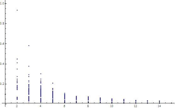
The x-axis is the word length and the y-axis shows the image metric for each word.
The shorter the word, the more it Fourier Transforms like individual letters, the longer the word, the more it transforms like a mushy rectangular blob.
What are the outliers on either side of the average for each word length? The words at the top of the point columns have letters with more lines and the words at the bottom of each column have more circular letters.
Here’s a question: are words with more line-letters more common than words with more circular letters?
I cycled through each word length and calculated the ratio: (frequency of the top outliers)/(average frequency) and the (frequency of the bottom outliers)/(average frequency).
Just to be clear, if the ratio > 1 then the frequency of the outliers was greater than the average frequency because the lower your frequency number, the more common your word. For example, “the” has frequency 1 as it is the most common word in the English language (yes, I realize the letter frequency was given the other way around). Similarly, if the ratio < 1 then the combination was less frequently represented in the top 4,960 words.
The resulting diagram shows the result — a preference in the English language for words with more line letter-combinations. The top 10% of the words had a ratio of 0.921. On the other side, the circular letters peaked the most at 20% of the words for a ratio of 1.079. (although the error bar on the 10% level was high enough to be consistent).
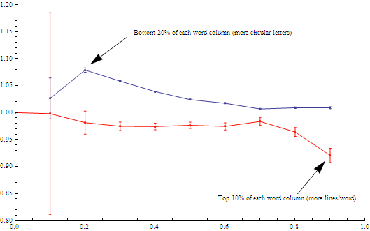
The blue line shows the ratio (bottom % frequency )/(average frequency).
The red line shows the (1-top % frequency)/(average frequency)
Why might we care about this? One application concerns the evolution of written language. If there was an ambiguity in how to spell a word, a line letter may have been chosen rather than a circular letter simply to save space!
The difference in paper space can be seen in the following two example sentences. They each have the same number of words with the same number of letters per word, but one takes up much more room than the other:
- Sir fit it in.
- Go be mad dad.
Incidentally, the sentences are a bit awkward because these words are taken straight from the 90% and 20% outliers pile.
Image analysis on texts
Why stop at words? Carrying on the image analysis method to works of literature provided a tantalizing clue, although it needs to be emphatically stated that the data set used here was embarrassingly small. But let’s not let that stop us.
I found an online collection of free ebooks, most of which are available as text documents, at Project Gutenberg. Project Gutenberg has mirror sites which allow you to download large collections of their books via ftp. Unfortunately, the categorization of the books is not available via the same method. At the moment, you have to click through their search forms to explore books in a particular category. I’ve emailed them to ask if they have a “master list” of all the books and their categorization, but am not holding my breath.
I downloaded four books, a science book (Einstein’s Relativity), a math book (The Number Concept, by Conant), a biography (Beethoven, by Fisher) and a mystery (Dead Men Tell No Tales, by Hornung). Fourier Transforming the entire text would require way too much memory, so I extracted small sections, converted them to images and took the FFT. Calculating the image metric for 50 such extracts and plotting them gave the following chart:
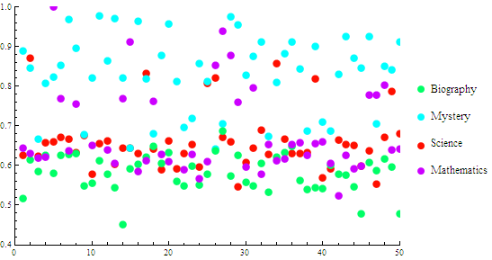
Image analysis metric applied to text extracts.
The mean value of the metric for each category was as follows:
- the science book = 0.661 +/-.051
- the mathematics book = 0.658 +/- 0.094
- the mystery book = 0.828 +/- 0.079
- the biography = 0.583 +/- 0.037.
The science and math books had very similar values while the mystery book had a much higher mean (higher proportion of line letters) and the biography book fell below the math/science category (more circular letters).
Whether or not this and future similar conclusions stand up to a larger data set of course needs to be tested. It would be especially intriguing if the relationship persisted for different languages.
Future steps
I would like to continue this project. Since the scripts have already been written, it would be easy to see how these conclusions change with more texts that have already been categorized and, especially, to see if the conclusions stand up for different languages. If anyone has access to such a data set, get in touch to collaborate.
References
Letter frequency data: http://en.wikipedia.org/wiki/Letter_frequency
Word frequency data: http://www.wordfrequency.info/intro.asp
Project Gutenberg free ebooks: http://www.gutenberg.org/
