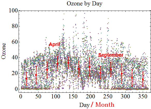
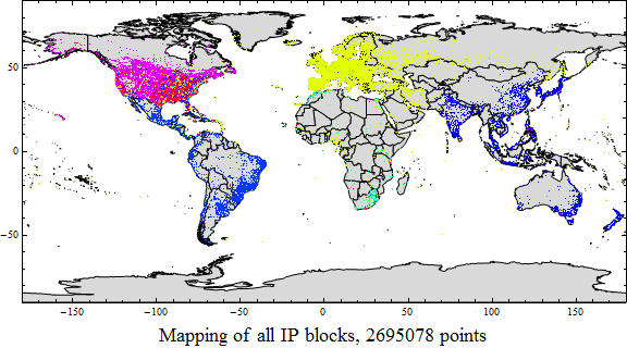
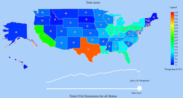
Earthquakes vs. Time of Day

66,725 Earthquakes from 1973 - 2011 with color indicating magnitude

Time and tide wait for no one. Add to that: earthquakes. I live in the San Francisco Bay Area, a.k.a. “earthquake country”, in a small house built in the 1950s before earthquake building codes had been created. Within the next 30 years, the USGS tells us we can expect a “big one” in the East Bay right along the fault where I dwell.

So here’s my question: If there’s a 30-year window for the next big one to occur, can I at least know the most likely time of day? This is not a crazy question. The time of day is really just a way of expressing where the sun is located with respect to your geographical location. The moon is responsible for sweeping the tides all around the Earth. So it seems reasonable to think that the moon or the sun may at least be an influence in “Earth tides” which might act as a trigger for earthquakes. Here’s a quick sketch showing my hypothesis:

This question turned out to be fairly straight-forward to answer and I’ll cut to the chase and say, no, not really. There are some hours that are a teeny bit more earthquake prone than others, but the variations proved to be statistically insignificant.

The Method

I downloaded all earthquakes magnitude 5 or greater from 1973 through mid-2011 from the USGS Global Earthquake Search website. This gave me a list of 66,725 earthquakes — a reasonable sized dataset. I mapped the positions and color-coded magnitudes of all 66,725 earthquakes (green = mag 5.0 up through red = mag 9.1), shown at the top of this blog entry.

It’s an interesting fact that these earthquakes span a time period of 338,117 hours which implies a chance of 20% for an earthquake (mag 5 or greater) during any hour. The chance during any hour for a magnitude 6 or greater earthquake drops to only 1.6%. By the time you get to a magnitude 7 or greater it’s much less than 1%/hr.

The next step was to calculate the right ascension of the sun and moon and translate the longitudinal position of each earthquake into right ascension to match. Below shows an illustration of what I’m describing.

The important thing to note is that the latitude of the sun, moon and earthquake can all be different and I am calculating the difference with respect solely to longitude. This is because I’m wondering about the most earthquake-prone time of day so the longitudes are the relevant quantities rather than the latitudes.

After these coordinates had been calculated for all 66,725 earthquakes, I found the difference of the position of the sun/moon with respect to each earthquake in terms of right ascension. Following that, I grouped the differences by “relative hour” (by which I mean the relative position as described above) and graphed the resulting histogram.

Position of the Sun vs. Earthquake Time

The histogram of the earthquakes relative to the position of the sun looked like this.

The blue bars show what the histogram should look like if there was an equal probability of having an earthquake regardless of the position of the sun and the red shows the actual data. You can see the bars are very close in size. There’s a small peak around the 17th hour. But is it statistically significant?

The mean number of earthquakes during any given relative hour was 2780 earthquakes. The standard deviation was +/- 60 earthquakes. The number of earthquakes in the 17th relative hour was 2902 earthquakes — just outside two standard deviations which shows it to be an outlier by 2 earthquakes. Not a strong outlier! In fact, the p-value using the Watson U-Squared test is a paltry 0.48 which is well outside the threshold for being a significant result. Translation: not publishable!

Position of the Moon vs. Earthquake Time

Since it is the moon, not the sun that is primarily responsible for sweeping the ocean tides around the Earth, perhaps I am looking at the wrong entity (actually, the sun is responsible for a smaller, secondary ocean tide, but the magnitude pales in comparison to the moon’s effect). The time of day has nothing to do with the moon’s position so if there worked out to be a correlation then you’d need to consult moon charts every day!

I redid my previous analysis, grouping earthquakes by position relative to the moon. The following histogram was the result:

As can easily be seen with the eye, the deviation of the data from the mean is even smaller this time (+/- 53). In fact, there were no points outside two standard deviations and the p-value was 0.33. Again, statistically insignificant!

Conclusion

In short, there’s no particular hour to be extra wary of earthquakes. Unfortunately, I’ll just have to settle for the USGS’s “sometime in the next 30 years”.

Data extracted from:
References:

-Lyndie Chiou

CDC Flu App Challenge

The CDC is getting into apps. They are challenging developers to design an app to fight the flu using mashups with their datasets as well as other publicly available datasets. Cash prizes! It seems like they are looking for nice ways to present and interact with flu data that will keep people educated about the flu year-round. You can design apps for just about any platform, including websites and mobile phones. The deadline is May 27, 2011.

-Lyndie Chiou

Economic Recovery in Red vs Blue States

I was chatting with my Dad recently and he brought up a debate he’d heard on the radio between a Republican and Democratic candidate.

The Republican candidate said that in our present-day recession economy, Republican states were better off than Democratic states. My Dad seemed to particularly relish how the Democratic candidate scrambled to defend his party but didn’t contradict anything the Republican guy was saying.

Politicians are known for saying anything to win elections. Is it really true that Republicans manage the economies of their states better?

I found a treasure trove of state political data on Wikipedia. I also found information on unemployment for the month of February 2011 at the website for the US Bureau for Labor Statistics. And finally, I was able to get an estimate of the budget gap/head via The Center on Budget and Policy Priorities.

And so I put everything together into a spreadsheet and stared at the data.

One assumption I’d always had (thanks to the New Deal era of President FDR) was that government spending was the best way to keep the country afloat during a recession. My data allowed me to plot unemployment vs. the state budget gap per person. Each dot in the graph below represents a state. The data is obviously very noisy, but there appeared to be a correlation between higher state budget gaps and greater unemployment. You could fit a line to this data, but the correlation was weak (only ~0.24).

The colors of the dots in this graph also show whether the state governor was a Republican or Democrat (if the governor’s party changed because of the November 2010 election, I went with the previous governor).

One might also conclude from this graph that Republican governors ran up larger state budget gaps and had higher unemployment than Democratic governors.  Just for the record, the state on the extreme right is Alaska, home of Sarah Palin. The state with the highest unemployment is Nevada.

Not wishing to make conclusions too quickly, we can use another metric to decide how to categorize the “Republicaness” of a state — the ratio of Republicans and Democrats in the upper and lower state legislatures.

It turned out that lower legislatures were all majority Democratic. That was surprising! In the chart below, red dots are more highly Republican legislatures and blue are more highly Democratic. Shades of purple show the degree of mixture. You can see the dots are all blue and shades of purple.

On the other hand, the upper legislatures in the states varied between majority Republican and Democrat.

The colors of the dots in this image now reflect the ratio of Republicans vs. Democrats in the upper legislatures. I’ve added threshold lines showing the highest value of the budget gap associated with each party. Clearly, the Democratic legislatures had larger budget gaps, but only narrowly. What struck me as a stronger relationship here was that purple, or split states, actually had the highest budget gap/person.

In fact, if I rotate the figure and fit a Gaussian bounding the outer edges…

The higher the budget gap, the more mixed the legislature. Note that the reverse was not true: a more mixed legislature did not necessarily imply that the budget gap was larger. In fact, there were several purple states very close to and even on top of the $0/head mark. Perhaps a graph of the standard deviation would also be enlightening:

Is it obvious that the more homogeneous the legislature, the more fiscally responsible its actions? Democrats spend more, but also tax more. Republicans tax less, but also spend less. An even mixture of the two bodies can lead to the extremes of spending less and taxing more (the $0/head Montana) or spending more and taxing less (the $1830/head Alaska).

It seems clear that majority Republican states are not better-off than majority Democratic states. But… Both the Republican and Democratic candidates could have gotten away with claiming that their states were better off than (some of) the purple states!

For your enjoyment, I uploaded my spreadsheet of state Republican vs. Democrat data to this website’s wiki: Republican and Democratic Economic Data, Feb 2011.

Footnotes:

Data extracted and combined from:

-Lyndie Chiou

Ratio of Republicans in State Upper Legislatures

Here’s an interesting relationship. The graph shows the percentage Republicans in the states Lower Legislatures versus the Upper Legislatures.

It would appear that if you’re a Republican, you have the best chances of winning an election in the lower house in states where the upper house is split. You will have a hard time in states where the upper house is either mostly Republican or Democratic.

Go figure…

The data for this spreadsheet has been uploaded to this website’s wiki: Republican and Democratic Economic Data, Feb 2011

-Lyndie Chiou

KDD Cup 2011

This year’s KDD Cup contest is similar in style to the Netflix competition, except 1st place is only $5000 instead of a million. Bummer. But it still seems like a fun contest.

There are two parts. The first track attempts to predict user music ratings and the second track tries to predict whether or not a user will rate a particular track at all. Contestants can choose either track or both.

The deadline for the KDD cup is June 30th, 2011.

-Lyndie Chiou

Tax Day Visualization Contest

Always a sucker for contests!

There’s a tax day visualization contest on datavizchallenge.org. The challenge is to visualize how politicians are spending your tax dollars. The deadline for submission is tax day, April 18th, 2011.

The website providing the details, whatwepayfor.com, has done a nice job providing the data and an interface for extracting slices of data in real time via http urls.

First prize wins $5000 and another $5000 goes to discretionary awards… Good luck!

-Lyndie Chiou

International Women’s Day

Thanks to Google’s ngrams project page I have wasted my scarce spare hours looking at micro trends in literature. A couple of months ago, the Google ngrams project presented a database of all the words from Google’s extensive book collection. Making the books freely available presents copyright issues, but a database of word frequency in a collection of books is legal. They even created a simple graphing tool so you can basically play with the data. Or you can download the entire dataset for your own purposes. Micro-trends in literature might not sound very exciting, but once I started trying words, it became an addictive tool to try to prove my zany cultural theories.

One graph seemed very appropriate for today, International Women’s Day.  I plotted the words “men”, “women” and “children” versus time. And look!

“men” in blue, “women” in red, “children” in green

The years range from 1800 to 2008 and you can see clearly that the word “men” (the blue line) rules by a long shot up until about 1920. To be fair, “men” can be used in a generalized sense to mean both men and women similar to the word “mankind”. Since there’s no context I can’t distinguish what percentage of the words actually refer to both sexes.

But the interesting part of the graph is the uptick in the usage of “women” starting during the era of 1960s feminism. Even more interesting, “women” overtakes “men” in the mid-1990s.

Shortly afterwards, “women” decreases and “men” once again rule. A decline in feminism? Or perhaps the bubble in the 1990s was due to the peak in so-called chick-lit which has since gone out of favor. To provide a cultural reference point, Bridget Jones Diary, the epitome of chick-lit, came out in 1996.

“Children” seem to have a steady increase all the way from the 1800s to the present day. The slow rate of increase in the word “children” surprises me since there’s been an explosion of children’s books since the days of Beatrix Potter. Perhaps Google has disdained uploading children’s literature into its database? I also tried the words “boy” and “girl” and they show a lower percentage of usage than “children”:

“children” in blue, “boy” in red, “girl” in green

Happy International Women’s Day.

-Lyndie Chiou

Google Brings Data Back

If you follow my blog (wink!) you’ll recall that I was surprised that Google cancelled its data hosting service, Palimpset. Well, they’ve brought it back big time, albeit under a new moniker. The Google Public Data Explorer was announced yesterday. You can upload any dataset you like, so long as you format the data using DSPL which is related to XML. The hosting service is totally free.

They’ve also got a service called DataWiki listed in their Google Labs section which allows users to upload “structured” data. I’m not sure how these two services differ and whether Google really needs both. But at least duplication is far better than the situation in 2009 when they cancelled the one data-hosting service they ran.

In addition to the data hosting, there is a set of tools which can be used to display the data. Right now, the home page shows a graphic for lifespan vs. number of offspring by geographical region. The graphic includes a cool slider which shows the fertility bubbles jumping around as time progresses.

I’m guessing this is a harbinger for Google to return to its research roots and take a step back from the profit juggernaut it has turned into.

A related snippet of news that I came across was the announcement by Intel that it is starting a center at Stanford devoted to visual computing. And GE recently came out with visualizing.org, a website devoted to data visualization which also incorporates other elements such as website contests. I noticed they have a contest for visualzing eco data with a $5,000 prize! Their ads have been appearing everywhere, including on this blog.


-Lyndie Chiou

Python data-mining and pattern recognition packages

The Python language has become one of the premier computational languages for scientific research on account of its many useful in-built data handling methods. Additionally, there are a number of science-oriented packages that rival industry-standard computational packages (I’m mainly thinking of Matlab). The most popular add-on Python science packages are NumPy and SciPy.

Python has a steeper learning curve than Matlab, but once the user has gained enough experience there’s a surprising wealth of modules that can be wielded for powerful results. Many of these Python add-ons came from academic institutions who decided to release their tools into the Python community for free use.

Data-mining in Python has become very popular. Two tools that I am briefly reviewing here are OpenCV and SciKits.learn.

I have already benefited from OpenCV, an open source machine vision package. The package is actually a collection of C++ libraries, but Boost Python wrappers have been written to open up the libraries to Python. Learning algorithms include boosting, decision tree learning, expectation-maximization algorithm, the k-nearest neighbor algorithm, the naive Bayes classifier, artificial neural networks, random forest, and support vector machine (SVM).

I’ve also recently come across scikits.learn. This is a more general-purpose collection of machine learning modules written for Python. As of this writing the project is relatively new, but already has a well-developed set of supervised learning modules: support vector machines and generalized linear models; and is developing a set of  unsupervised learning modules: clustering, gaussian mixture models, manifold learning, ICA, and gaussian processes.

Just so you know, I wanted to point out that SciKits is actually a group of modules (sckikits.learn being one) built using SciPy. It includes a statistical computation module, image processing routines and vector plotting algorithms among many, many others.

Are there any data-mining/pattern recognition Python packages that you can add to this list?

Updates:

A big thanks to Ben Racine who alerted me to:

  • Machine Learning Python — aka “mlk”. This package has been developed via an Italian research center, Fondazione Bruno Kessler. From the package homepage, I see it includes: SVM (Support Vector Machine), KNN (K Nearest Neighbor), FDA, SRDA, PDA, DLDA (Fisher, Spectral Regression, Penalized, Diagonal Linear Discriminant Analysis) for classification and feature weighting, I-RELIEF, DWT and FSSun for feature weighting, *RFE (Recursive Feature Elimination) and RFS (Recursive Forward Selection) for feature ranking, OLS, (Kernel) Ridge Regression, LASSO, LARS, Gradient Descent for Regression, Elastic Net, DWT, UWT, CWT (Discrete, Undecimated, Continuous Wavelet Transform), KNN imputing, DTW (Dynamic Time Warping), Hierarchical Clustering, k-medoids, k-means, Resampling Methods, Metric Functions, Canberra indicators
  • Machine Learning Tooklkit — aka “MILK” — was written by MIT author Luis Pedro Coelho.  Its focuses on supervised classification via  SVMs (based on libsvm), k-NN, random forests, and decision trees. It also performs feature selection. These classifiers can be combined in many ways to form different classification systems. For unsupervised learning, milk supports k-means clustering and affinity propagation.


-Lyndie Chiou

Visualize word freqency

I came across a visualization website that can transform a blog’s text (or the text of any url) into a visual display. Wordle.net takes a text and churns out a graphic wherein each word is sized according to frequency. Then it arranges all the words together in a  vaguely oval shape which describes how big the dataset is. The squarer the picture, the greater the number of words. Here’s the wordle for this blog: ..and just for fun, here’s the wordle for the first page of the wiki:

-Lyndie Chiou


3 visitors online now
0 guests, 3 bots, 0 members
Max visitors today: 6 at 08:21 am UTC
This month: 12 at 02-02-2012 01:28 pm UTC
This year: 23 at 01-04-2012 10:32 pm UTC
All time: 44 at 11-08-2010 02:08 am UTC