It was brought to my attention that a useful result for image analysis of the alphabet would be to demonstrate a method that identifies the alphabet letters and numbers as part of a computer vision project.
Best and worst fonts for FFT analysis
Certainly there are a huge array of metrics one could derive to separate out all the letters, numbers and symbols. If you are guaranteed a particular font, then you don’t need to work very hard at all. Just looking at the mean deviation of the FFT of an image of the letters is almost enough to provide separation. Throw in the 2D FFT (which you already computed) and you’re all set.
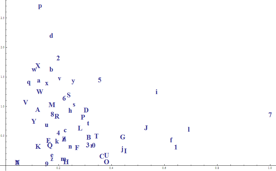
Times New Roman showed the best separation between letters and numbers. The x-axis is FFT and the y-axis is mean deviation on FFT.
I computed the two metrics on 26 different fonts and found some interesting trends. First, the absolute best font for separation was Times New Roman. Not far behind, surprisingly, were fonts that resembled actual handwriting, like French Script, Freestyle Script and JazzText.
The absolute worst font was FixedSys:
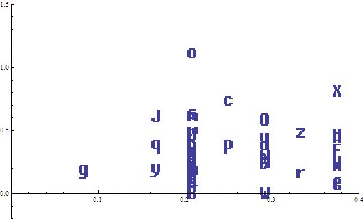
Worst font for clustering using FFT! Lots of overlapping.
Hopeless mess
The question of distinguishing the writing of ANY font was a trickier issue. When I computed the results for the 26 different fonts and plotted the results, this was the overlapping shmear that resulted (each color represents a different letter or number and the idea would be to cluster the colors together to identify a letter/number):

Deviation of the FFT vs. FFT — each color represents the resulting plot points for a different symbol
Clearly a hopeless mess! In retrospect, template matching is closer to how our human brains recognize letters whereas all the serifs, non-serifs, swooshes and swirls from the different fonts will only serve to confuse a frequency-based recognition system. The more a font diverges from pure lines and circles, the greater the number of frequencies generated in the FFT. This quickly swamps the structure of the original letter, number or symbol.
In fact, Googling around the Internet shows that reading text is not a trivial problem. The post office currently uses a system developed by the University of Buffalo to read hand-written mail. In the early days, the system rejected 85% of the mail it received and processed the remaining 10% of its envelopes with a 2% error rate. Twenty years later, the reading rate is now 95% (which still ensures the job security of 1,900 postal employees whose sole task is to read our chicken scratch).
For those who like OpenCV (an open source computer vision library with C++ and Python compatibility), there’s a function called cvMatchTemplate() which will identify letters and numbers. However, it breaks easily when the lighting is uneven, there are scaling or orientation changes, etc., etc. Another function that can be used from within OpenCV is CvHaarClassifierCascade which performs facial recognition (substitute the “face” to be recognized with images of letters).
Resources:
Post-office letter reading system:
1. Wall Street Journal overview:
http://online.wsj.com/article/SB10001424052970204394804577012122145910692.html
2. Resources from CEDAR — Buffalo University’s Center of Excellence Document Analysis and Recognition:
http://www.cedar.buffalo.edu/papers/publications.html
