My interactive visualization of CO2 emissions by state
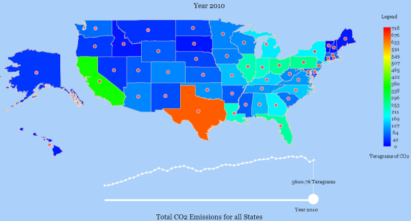
This post is related to NPR’s Planet Money’s podcast “Episode 472: The One-Page Plan To Fix Global Warming“. In the podcast, Alex Blumberg and David Kestenbaum describe their approach to reduce carbon dioxide (CO2) emissions, the chief cause of global warming. Their one step approach is to tax emissions. It’s an interesting podcast, well worth the …