 I was chatting with my Dad recently and he brought up a debate he’d heard on the radio between a Republican and Democratic candidate.
The Republican candidate said that in our present-day recession economy, Republican states were better off than Democratic states. My Dad seemed to particularly relish how the Democratic candidate scrambled to defend his party but didn’t contradict anything the Republican guy was saying.
Politicians are known for saying anything to win elections. Is it really true that Republicans manage the economies of their states better?
I found a treasure trove of state political data on Wikipedia. I also found information on unemployment for the month of February 2011 at the website for the US Bureau for Labor Statistics. And finally, I was able to get an estimate of the budget gap/head via The Center on Budget and Policy Priorities.
And so I put everything together into a spreadsheet and stared at the data.
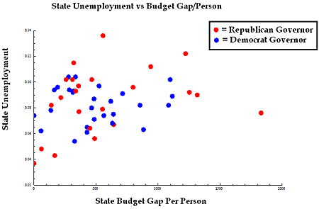
One assumption I’d always had (thanks to the New Deal era of President FDR) was that government spending was the best way to keep the country afloat during a recession. My data allowed me to plot unemployment vs. the state budget gap per person. Each dot in the graph below represents a state. The data is obviously very noisy, but there appeared to be a correlation between higher state budget gaps and greater unemployment. You could fit a line to this data, but the correlation was weak (only ~0.24).
The colors of the dots in this graph also show whether the state governor was a Republican or Democrat (if the governor’s party changed because of the November 2010 election, I went with the previous governor).
One might also conclude from this graph that Republican governors ran up larger state budget gaps and had higher unemployment than Democratic governors. Just for the record, the state on the extreme right is Alaska, home of Sarah Palin. The state with the highest unemployment is Nevada.
Not wishing to make conclusions too quickly, we can use another metric to decide how to categorize the “Republicaness” of a state — the ratio of Republicans and Democrats in the upper and lower state legislatures.
It turned out that lower legislatures were all majority Democratic. That was surprising! In the chart below, red dots are more highly Republican legislatures and blue are more highly Democratic. Shades of purple show the degree of mixture. You can see the dots are all blue and shades of purple.
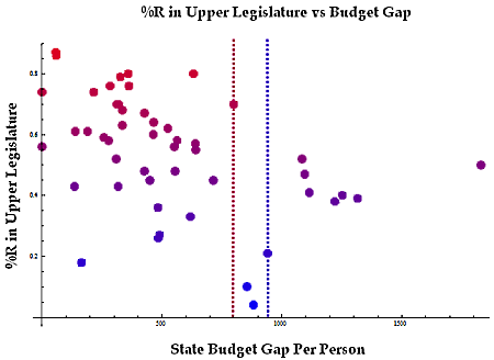
On the other hand, the upper legislatures in the states varied between majority Republican and Democrat.
 The colors of the dots in this image now reflect the ratio of Republicans vs. Democrats in the upper legislatures. I’ve added threshold lines showing the highest value of the budget gap associated with each party. Clearly, the Democratic legislatures had larger budget gaps, but only narrowly. What struck me as a stronger relationship here was that purple, or split states, actually had the highest budget gap/person.
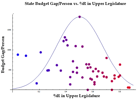
In fact, if I rotate the figure and fit a Gaussian bounding the outer edges…
The higher the budget gap, the more mixed the legislature. Note that the reverse was not true: a more mixed legislature did not necessarily imply that the budget gap was larger. In fact, there were several purple states very close to and even on top of the $0/head mark. Perhaps a graph of the standard deviation would also be enlightening:
Is it obvious that the more homogeneous the legislature, the more fiscally responsible its actions? Democrats spend more, but also tax more. Republicans tax less, but also spend less. An even mixture of the two bodies can lead to the extremes of spending less and taxing more (the $0/head Montana) or spending more and taxing less (the $1830/head Alaska).
It seems clear that majority Republican states are not better-off than majority Democratic states. But… Both the Republican and Democratic candidates could have gotten away with claiming that their states were better off than (some of) the purple states!
For your enjoyment, I uploaded my spreadsheet of state Republican vs. Democrat data to this website’s wiki: Republican and Democratic Economic Data, Feb 2011.
Footnotes:
Data extracted and combined from:
- The bureau of labor statistics: http://www.bls.gov/
- wikipedia’s map of red/blue states and data: http://en.wikipedia.org/wiki/Red_states_and_blue_states
- The Center on Budget and Policy Priorities


Very interesting analysis, I am surprised more people have not posted responses. Probably because the analysis is objective, rational, and relatively apolitical. It seems to get attention you need to throw mud on someone.
Thank you!
interesting. The trend is definitely toward balanced budgets with republicans. The second to last graph, split it in half and the right side (republican) looks optimal compared to the left side (democrat). Problems seem to arise when neither party has to take responsibility for their actions because neither has full control.
I agree with bob, I also split that second to last graph apart in my mind. It may not look all that drastic when you look at it, but think about how far from the normal curve each point is. The left side is, on average, closer to the line. I don’t want to hit all of the statistical implications, but even without strong correlations, this data is very telling.
Interesting analysis. I had heard that the red states get more money from the federal government than they contribute and conversely the blue states give more money to the federal government than they receive in return. If true (and I haven’t looked up that info again), how would that factor into the analysis?
Very good, thought provoking work. What I would love to see now are the economic growth numbers for each state overlayed with this data!
how about income growth… since 2007 red states 4.6% blue states 0.5%, thats 9 times higher in red states then blue states.
Matt, thanks for the comment — I actually wrote this post in April, 2011. Where did you get this statistic? It might be interesting to look at an update.
I would love to see a post-2012 election update to this, especially where states changed the parties of the governors….
Agreed! Follow-ups can be more interesting than the original article. Sometime soon…
Very well presented. Thank you.
Great read, I also agree with Bob